Mazda announces the new Shinari Concept Car and new design cues
Mazda announces the new Shinari Concept Car and new design cues
How do you feel when you see VW rims on Skoda?
23 members have voted
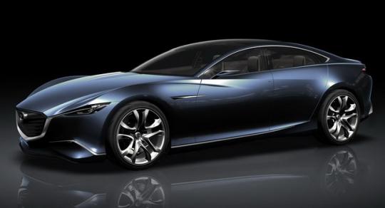
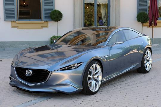
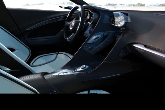
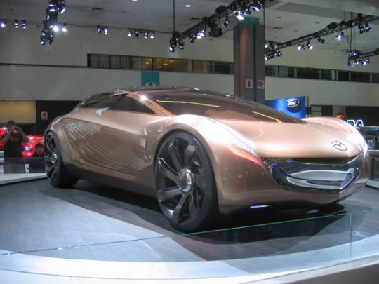
It's no longer the Nagare design philosphy for Mazda but the Shinari, said Mazda at a press conference in Milan a few days ago. The Shinari design concept car takes its design language from the Japanese concept of 'Kodo' or 'soul in motion'. This new concept will replace the natural Nagare concept which takes the flow of motion in nature. In other words, both are ideas about movement, with the new concept supposedly more soulful than the earlier more nature inspired one.
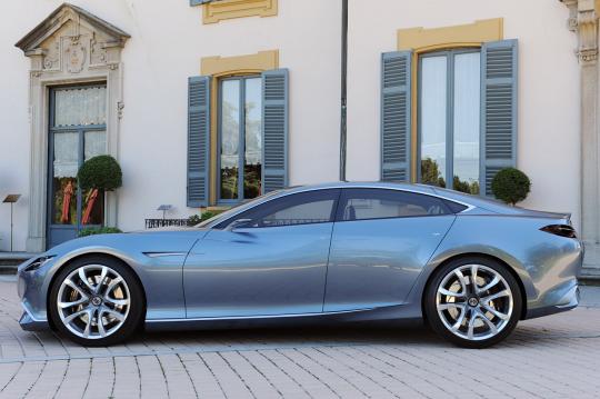
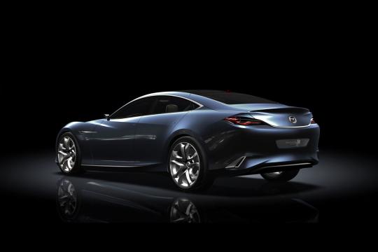
The Shinari design philosophy consists of a large gaping grill which is slightly more sombre looking than the 'smiley' of the Nagare concept. The lights are slimmer and the car looks more European with its Maserati Quattroporte/Aston Martin Rapide like stance. It is slightly more subtle than the Nagare, which has curves and lines. Like water flowing. Or you may also say, a less 'happy' design.
Anyway, Mazda had displayed the four door Maserati Quattroporte (from the front)/Aston Martin Rapide like concept car at the press conference and the photos herein are official renderings that have been presumably leaked on the net. Some say that the styling cues may surface in the RX8 or the Mazda 6 replacement as Mazda's design chief Ikeo Maeda mentioned to journalists that the Shinari will become the next generation of the Mazda design language.
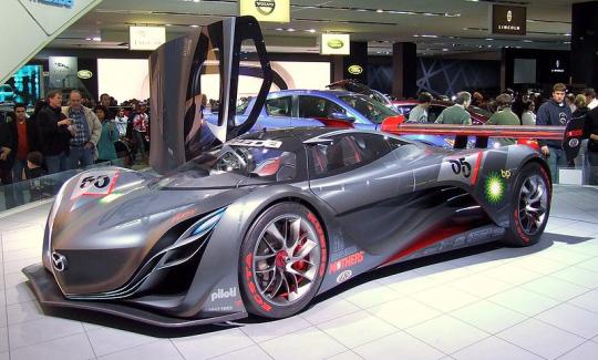
The older Nagare concept was penned by Mazda's previous design chief, who has since joined Renault. There are two reasons why Mazda chose to change the design philosophy. One is that the Nagare concept with its smiley face and curves and cuts everywhere is hard to translate to metal. The more cuts and curves means more shape forming. Meaning panel work may be at an extra cost for Mazda. The face lifted Mazda 5 MPV was restyled to the latest Nagare concept which was showcased in the Furai concept car and it did not seem too successful with all those extra lines at the side of the MPV. I.e Too much style for style's sake.
But the second reason could be stronger. A new design chief would want to prove his mettle over his predecessor. Hence the change in design philosphy. What do you think?
Live Photos copyright

1 Comment
Recommended Comments
Create an account or sign in to comment
You need to be a member in order to leave a comment
Create an account
Sign up for a new account in our community. It's easy!
Register a new accountSign in
Already have an account? Sign in here.
Sign In Now